 If you were around the knitting Internet (yes, there is such a place) at the end of last week or over the weekend you may have already heard about Stitch Maps, a new project by knitting chart enthusiast J. C. Briar. Briar’s book (which I have read but somehow failed to actually review) Charts Made Simple
 is a really good book for teaching how to use knitting charts of all sorts.
Briar is clearly a visual thinker and knitter, and she has taken visual representations of knitting even further with her latest project.
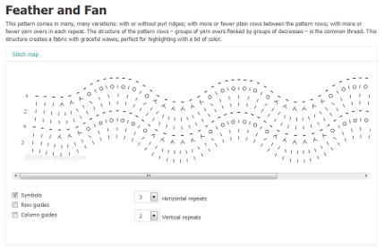
If you look at that picture up there, which is a version of Feather and Fan, you might think that it looks like a crochet chart. And it does. Crochet charts have always been a more literal visual representation of the work, because it’s difficult to symbolize the difference between, say, a double crochet and a half-double crochet any other way.
But knitting charts have always been flat, I guess because stockinette stitch is flat, or because whoever started charting knitting didn’t think to make the chart look like knitting.
J. C. Briar did. And the result is a little jarring if you’re a knitter, but still pretty darn cool. And it’s actually really logical, because the map can show, for instance, the curving of the Feather and Fan pattern, and how two stitches from the previous row come together in a knit 2 together on this row.
I don’t know if this sort of stitch mapping will catch on, because it also takes up a lot more space in print, and I imagine it might be difficult to represent different sizes of garments on the same chart. But for simply charting out stitch patterns, it’s very cool and I look forward to playing with it some more.
What do you think about stitch maps as opposed to more traditional knitting charts? Would you ever knit from one?
[Photo via Stitch Maps.]
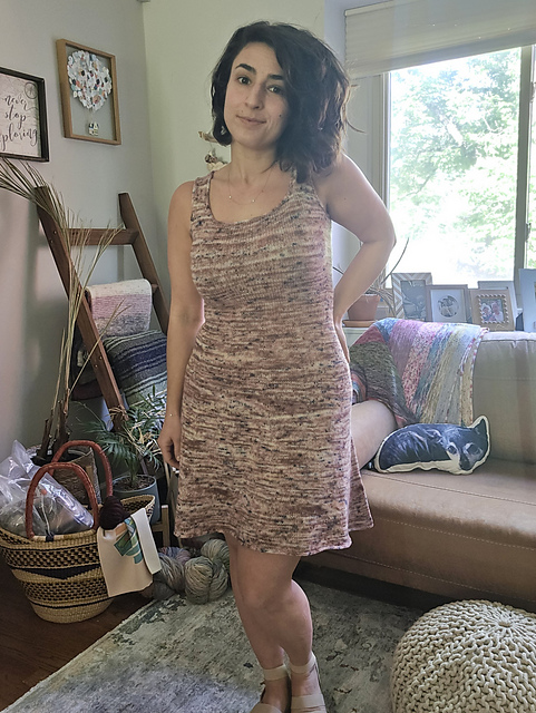
 I know knitting a dress sounds like a major time commitment. And that’s before I even tell you that this particular dress, the Sixth Ave Skater Dress by Briana Luppino, is worked in light fingering weight yarn.