 The Pantone Color Institute makes a lot of press for itself around this time every year by announcing what it predicts will be the “color of the year” in the coming year. Based on its trend research and what’s going on in design and in the wider world, they make a choice of what they think we’ll be seeing more of on the runways, in home decor and elsewhere.
Or two choices, as is the case for 2016.
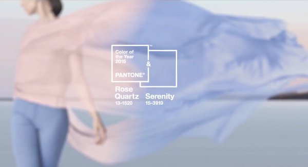
The first-ever colors of the year are Rose Quartz and Serenity, or, put less poetically, pastel pink and blue.
You can guess that the mood of the world played a part in a color named “Serenity” sharing top honors:
As consumers seek mindfulness and well-being as an antidote to modern day stresses, welcoming colors that psychologically fulfill our yearning for reassurance and security are becoming more prominent. Joined together, Rose Quartz and Serenity demonstrate an inherent balance between a warmer embracing rose tone and the cooler tranquil blue, reflecting connection and wellness as well as a soothing sense of order and peace.
Pantone calls Rose Quartz “persuasive yet gentle,” while Serenity is “weightless and airy…bringing feelings of respite and relaxation even in turbulent times.”
As you might guess, its suggested color pairings rely heavily on other pastels, as well as light and medium grays and browns. And I do love pink and brown, I have to say.
What do you think about this color combo? Is it calm and collected, or too babyish for your tastes? Will you knit anything using these colors in the coming year? I’d love to hear your thoughts!
[Photo via Pantone.]
 It’s well known (among knitters, anyway) that knitters seem to love chickens as a motif and a subject of our knitting projects. The Emotional Support Chicken and all the other